
This subtle detail has sparked fascination online, with many now describing the letterform as a quiet wink—a hidden gesture of friendliness embedded in one of the world’s most recognizable brands. But is this a brilliant piece of intentional design from over a century ago? Or is it a modern projection, shaped by our longing for meaning in familiar symbols?
What People Are Seeing
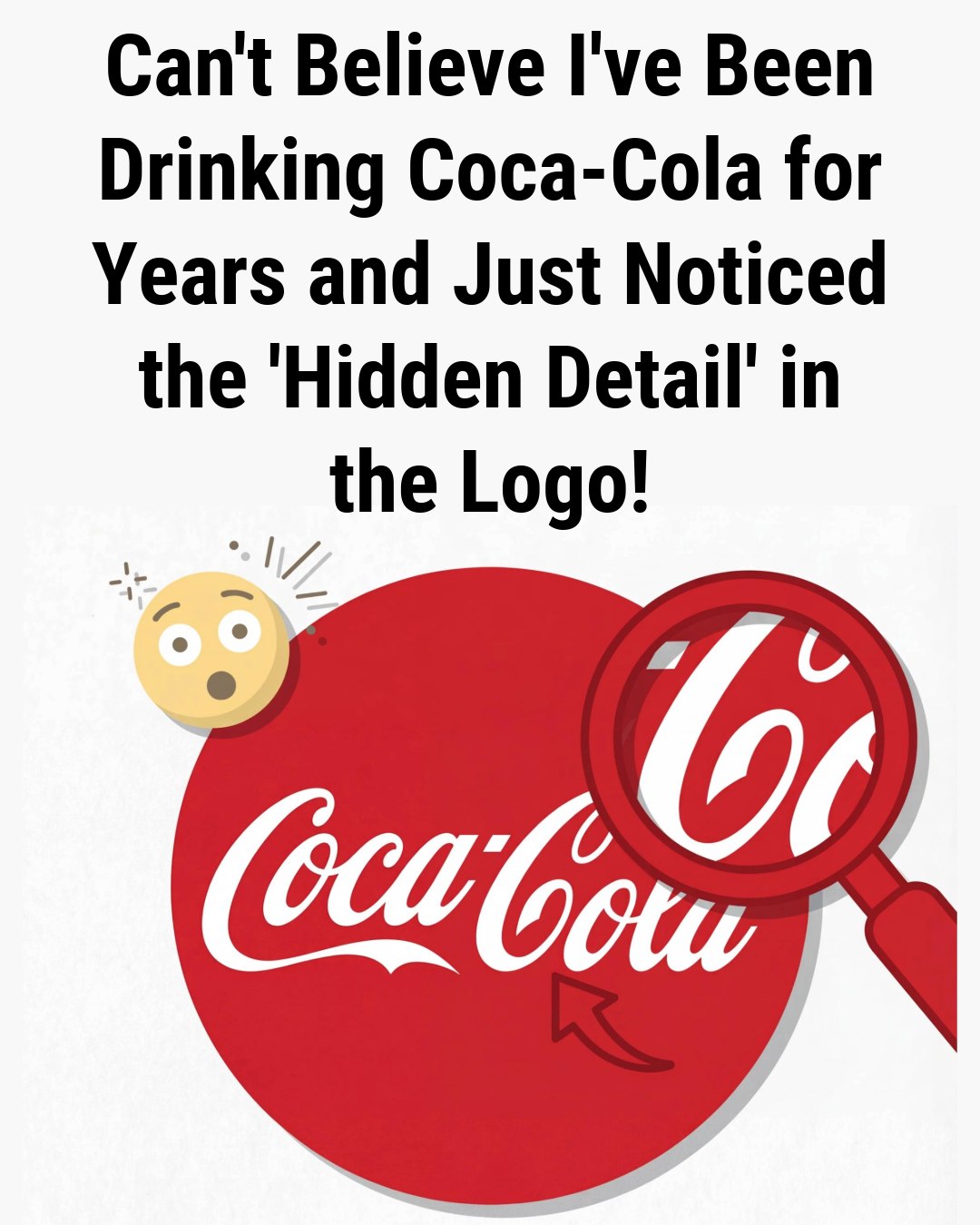
Take a close look at the classic Coca-Cola wordmark, rendered in its flowing Spencerian script. The letters glide with rhythmic grace—but it’s the second “C” that stands out. Its upper arc sweeps outward slightly farther than typical, then curls under in a soft, upward-facing arc. Tilt your head, and it’s not hard to imagine it as a smile: gentle, open, reassuring.
To many, it feels less like typography and more like a quiet hello—“I’m glad to see you.” Some even call it a covert wink, a secret shared between the brand and the viewer. Like seeing a face in the clouds or Jesus in a piece of toast, this interpretation thrives on pareidolia: the human tendency to find familiar shapes—especially faces—in abstract forms.
What History Actually Tells Us
The Coca-Cola logo was born in 1886, not by a branding agency, but by Frank Mason Robinson, a bookkeeper for the fledgling soda company. Tasked with naming the product and designing its label, he chose “Coca-Cola” for its euphonious rhythm and rendered it in Spencerian script—a graceful, looping handwriting style popular in 19th-century business correspondence.]
SEE NEXT PAGEAt the time, this elegant cursive wasn’t a marketing ploy; it was simply the standard for formal writing. The curves and flourishes were aesthetic conventions, not coded emotional signals. The now-iconic red background? That didn’t appear until decades later. The “Dynamic Ribbon” swoosh? Not added until 1969.
Critically, no archival evidence—no memos, sketches, advertisements, or design notes—suggests Robinson or early Coca-Cola executives ever intended the second “C” to resemble a smile. There are no vintage ads that play on this idea, no internal documents hinting at “hidden joy” in the lettering. The logo was crafted for legibility and elegance, not psychological subtext.
ADVERTISEMENT
